Web Experience
RomemberMe
The project designed and realized for the photographer Anna Sincini is centered on one of her specialties, weddings.
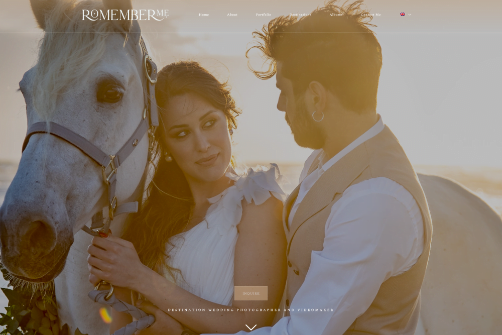
With Romember me, the main goal was to create an engaging and memorable user experience, capable of inspiring and informing couples about Anna’s photography service. Therefore, we decided to develop a site that not only showcased the quality of Anna’s work at its best but also offered an intuitive platform for the user.
We developed a responsive design and a user-focused navigation to immerse the client in the world of Romember me. We also devised a simple way to display essential information, while containing the background of each page so that Anna could best showcase her photographs and make them stand out.


To achieve this, we designed an interactive layout aimed at capturing the visitor’s attention. We used a combination of motion effects and animations to create unique navigation experiences. We also used larger-than-average images to give the photographer’s photos a strong visual presence, while the page scrolling utilizes parallax technique to enhance the visual impact.
Thanks to all these elements, we created an interactive design that keeps the navigation experience fresh and exciting, inviting visitors to continue scrolling through the page.
The Romember me project achieved great success with Anna Sincini, who expressed her happiness and enthusiasm about the result. Our goal was to create a site that could convey the feeling of a wedding, an emotional experience: thanks to the extensive use of images, colors, and videos, we achieved that goal. We also used a dedicated portfolio section where couples can view the services offered by Anna.
The client’s feedback was extremely positive, exceeding her expectations. She stated she was thrilled with how we made her work visible to everyone, providing a unique experience to the visitors of the site.