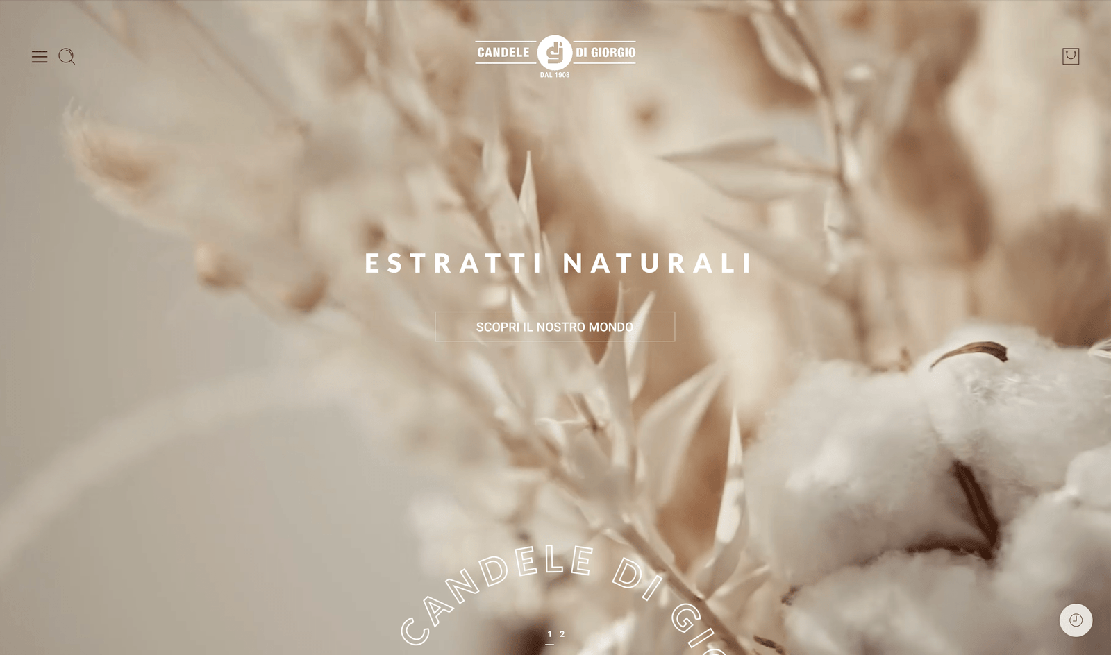
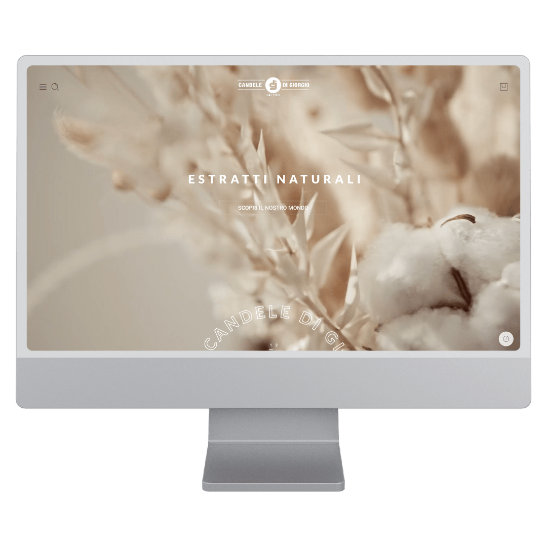
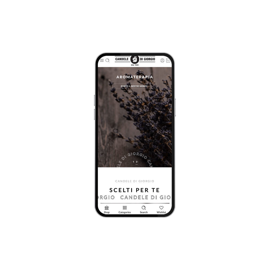
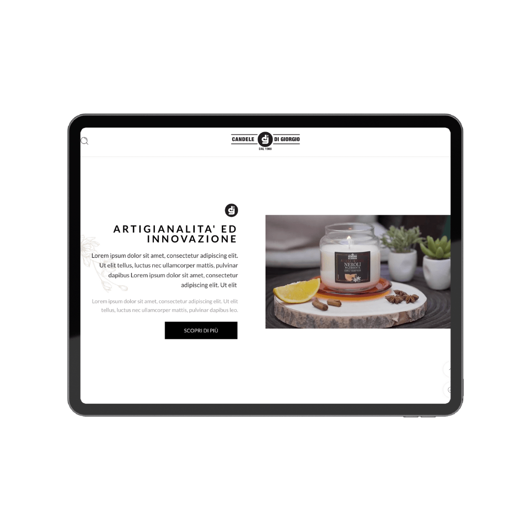
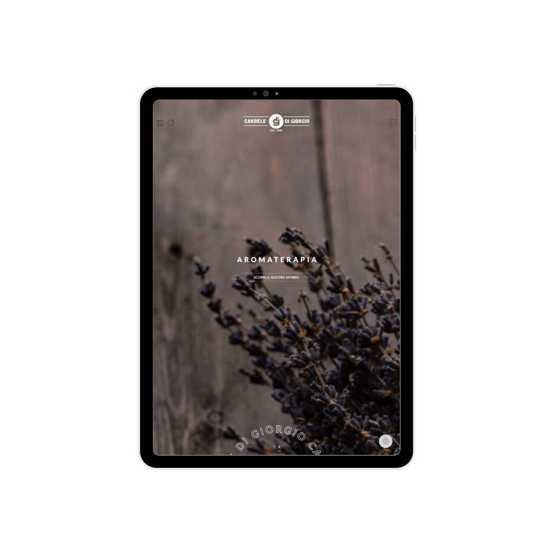
The primary goal of our project was to provide a dynamic and high-quality online showcase for Cereria di Giorgio’s new product line. We aimed to create a modern and elegant image that reflected the tradition and craftsmanship of the candles, allowing users to explore and purchase products in a simple and engaging way.
Design Approach
Our Methodology
To achieve this goal, we adopted a strategic and meticulous approach. We began by carefully analyzing the client’s needs and studying the luxury candle market. Based on this information, we designed and developed a web app that combines aesthetics, functionality, and ease of use. Our team worked in collaboration with UI/UX design experts and developers to create an intuitive and appealing interface. We implemented a robust product management system, integrated with a smooth and secure purchasing process. Throughout the development process, we subjected the platform to thorough testing to ensure high performance and a flawless user experience.
Colors
Color Selection
In choosing the colors, we were inspired by the elegance and sophistication of the elite candles offered by Cereria di Giorgio. The primary color, #FFFFFF (white), was used to create a clean and bright background, highlighting the products and images. The secondary color, #000000 (black), was chosen for impactful text and contrast. The tertiary color, #B8B8B8 (light gray), was used for nuances and details, adding a sense of subdued elegance. As an accent color, we selected #F1DCB2 (light beige), which evokes the warm tones of candle flames, adding a touch of sophistication.
Font
Font Selection
The choice of fonts was meticulously made to ensure a clean and elegant presentation of content. The primary font used for headings and main texts is Lato Regular, known for its exceptional readability. To highlight important elements like the titles of key sections, we used Lato Bold, which provides added emphasis. For fixed-width text and finer details, we selected Lato Hairline, offering crisp legibility and an aesthetic delicacy.
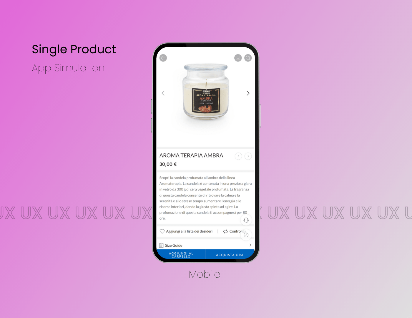
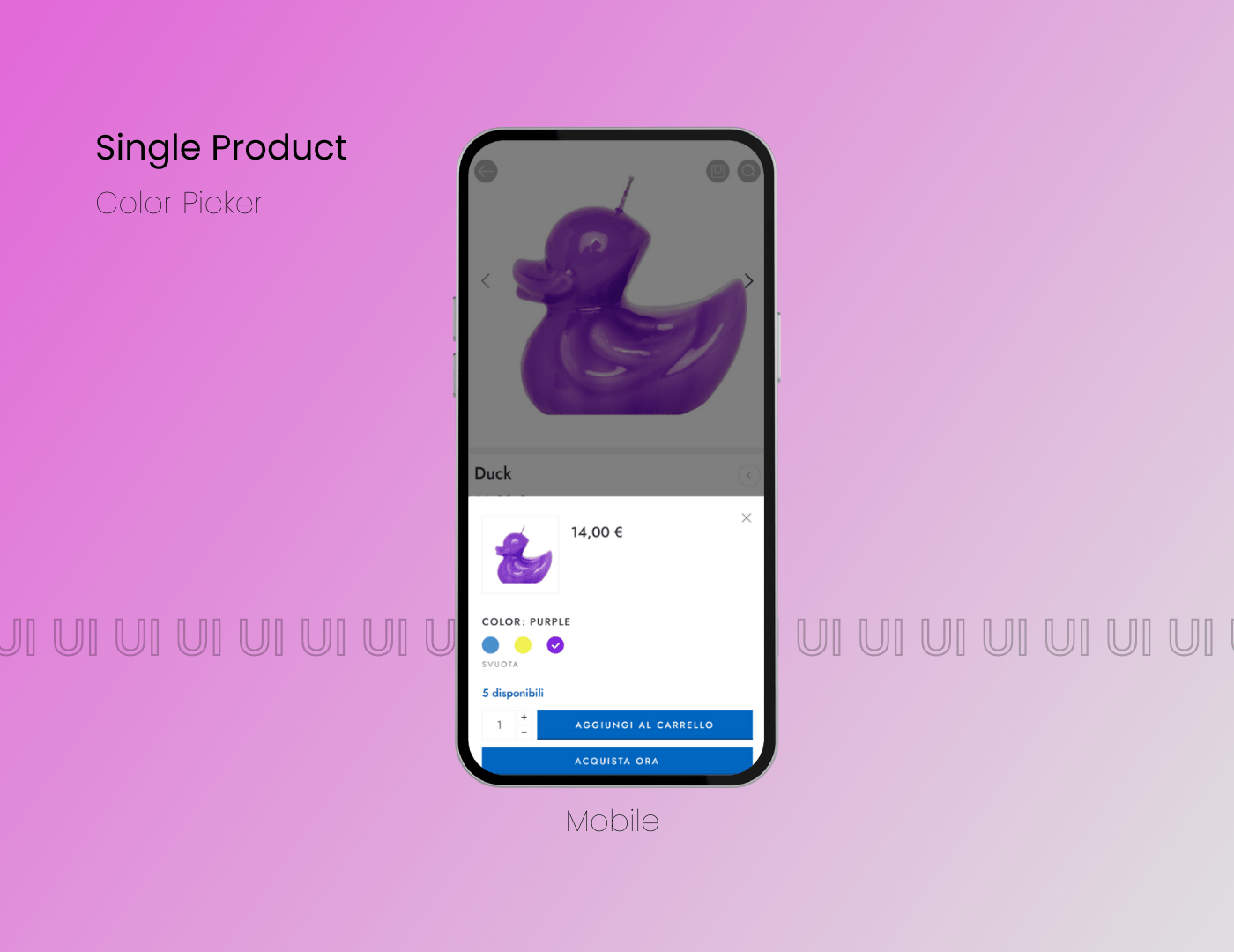
The Solution
The Final Result
The result of our work was a success, with excellent feedback from the client and users of the platform. Cereria di Giorgio has obtained a new digital face, presenting its elite products in an engaging and professional manner. The Candele di Giorgio e-commerce platform allowed users to explore the wide range of candles available, make purchases simply and securely, and contributed to strengthening the company’s position as a leader in the sector.